DROID 3 Review
2011-07-11
There are barely any DROID 3 reviews on the Web, so I thought I’d try my hand at gadget blogging. I ordered the DROID 3 from Verizon Wireless on Thursday July 7, the day it was announced, and it was delivered the next day. The DROID 3 is my third DROID. I used the original DROID from the summer of 2010 until a month ago. I’ve used the DROID 2 Global for the past month. And now I’m the owner of a DROID 3.
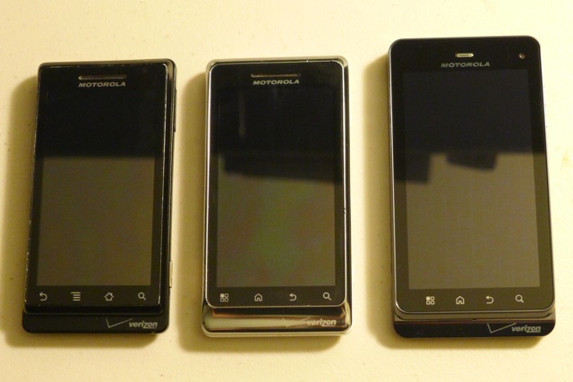
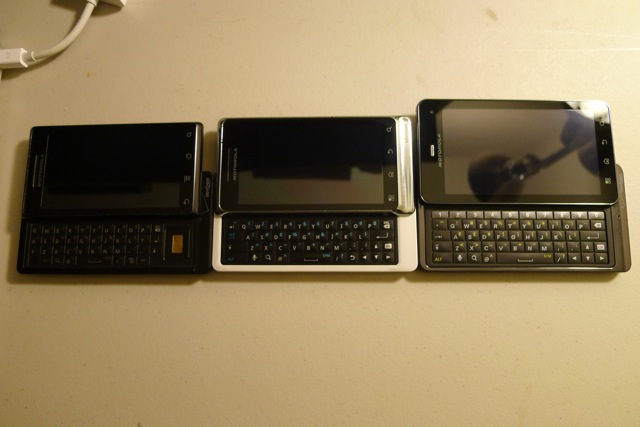
Here are my DROID, DROID 2 Global, and DROID 3:


The Original DROID
I love the original DROID. Released seven months before the iPhone 4, it sports a high resolution display with nearly invisible pixels. It’s well-built and solid. “It feels like a gun,” remarked a colleague upon holding it. The DROID literally saved Motorola, and propelled Android OS to the pole position it occupies today in the smartphone market. And it’s the first and only phone on Verizon to run stock Android. I was thrilled to switch to it after two years on AT&T with an iPhone 3G.
But earlier this year, the DROID started showing its age. The interface ran slow. Very slow. I rooted it, ran a custom Gingerbread ROM, and dabbled with overclocking. But the frustrations continued to mount. Battery life was abysmal. I had planned to wait for the DROID Bionic, but its launch was delayed with no firm date announced.
The DROID 2 Global
About a month ago, I bought a used DROID 2 Global on eBay. It has two notable qualities. First, it’s fast. The 1.2 Ghz CPU and dedicated GPU provide a welcome upgrade over the original DROID. Second, the DROID 2 Global’s build quality is atrocious. Unlike the original, it’s not solid. Its back is covered in cheap plastic, and the plastic front bezel is painted as fake chrome. The power button is sticky and soft. In other words, the DROID 2 Global doesn’t feel like a gun. It feels like a cheap plastic toy.
The MOTOBLUR skin is unwelcome. The typography is sloppy, particularly in the status bar. Overall, the DROID 2 Global’s CPU covers up for a lot of unforced errors on the part of Motorola. I planned to upgrade as soon as a better phone came out.
The DROID 3
Not wanting to wait for the DROID Bionic, or Samsung Galaxy S II, I pulled the trigger and bought an unsubsidized DROID 3 on launch day. Overall, I’ve been happy with my purchase. The build quality is closer to the original DROID. This phone feels solid, and the larger screen size (increased to 4 inches from 3.7 inches) is a plus. The slide-out keyboard feels great, with an additional fifth row dedicated to numbers. Because I incorporate numbers into my passwords (using password recipes), signing into my various accounts was much more pleasant with the new keyboard. The DROID 3 runs Gingerbread 2.3, a step up from Froyo 2.2 on DROID and DROID 2 Global. And its internals, featuring a dual-core 1 Ghz processor, enable a smooth user experience.
The most controversial aspect of the DROID 3 (and other Motorola phones of this generation) is it’s qHD (quarter HD at 960x540) display. A high resolution display is usually very welcome, but the PenTile screen technology Motorola incorporates is decidedly unwelcome. It’s significantly poorer than the display shared by the DROID and DROID 2 Global. Pixels on solid colors are visible. Gradients look jagged. Scrolling white text on a black background results in a hideous effect. When playing games like Angry Birds, or scrolling through home screens, there’s a shadowing that occurs with fast moving elements across the screen.
Motorola seems to have tailored its MOTOBLUR skin with the shortcomings of the screen in mind. The PenTile technology does best when displaying shades of blue, and so MOTOBLUR has ditched Gingerbread’s green and black motif for a blue one. Where Android likes use white text on a black background for Settings, MOTOBLUR has inverted that to hide the problems associated with that color combination. Speaking of colors, greens aren’t at all vibrant, like on the Samsung Nexus S. Instead, bright greens end up looking like pea soup. The pixelation on reds and yellows is especially painful. The home screen interface on MOTOBLUR is silly, so I switched to GO Launcher EX on the recommendation of Leo Laporte.
But after several days, I think I can live with the inferior qHD screen. The pixelation is only noticeable when looking for it, though I wish it weren’t noticeable at all. It’s disappointing that the original DROID, released in the fall of 2009, looks significantly better than the new DROID 3.
Battery life is yet to be determined. It was excellent for the first two days, and then rapidly dropped from 100% to 40% in the course of a few hours on the third day, despite not being actively used. I’ve disabled GSM support (the phone is global). That may help things.
One disappointment that may be a fluke: My DROID 3’s main camera stopped working after the first day. All I get is a black screen in the camera app, even though I do get a working picture when switching to the front-facing camera. I’ll have to ask Verizon for a replacement unit.
I do plan on keeping that replacement unit for the long term. The DROID 3 is a good phone, despite its screen, and it’s a worthy successor to the original DROID. To read first impressions from other DROID 3 owners, head on over to the Android Forums.
blog comments powered by Disqus